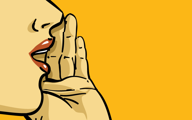
I’m quite the avid Pinterest “pinner.” It’s rare a day goes by that I don’t pin at least one or two nuggets of inspiration to one of my boards. So it definitely stood out to me when, all of a sudden, the option to “Pin” was gone. Replaced instead with an obvious, dull “Save”. Wait, what? Isn’t the whole point to “pin” things? Isn’t that the schtick? So I Googled it. Turns out, the reasoning was much more complex.
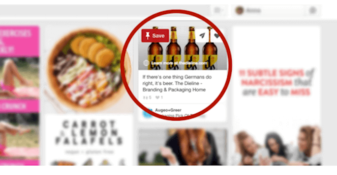
Pinterest’s new Save Button
It turns out that what makes sense to some people, may not make sense to others. Pinterest expressed their desire to reach their international markets. However, they noticed very low rates of users actually pinning things to their boards. Why? Turns out “Pin It” does not translate to a lot of other cultures – it either has other connotations, negative connotations, or doesn’t make sense entirely. So Pinterest changed the button, to something more universal – “Save”. Since the change, Pinterests reports an impressive increase in the number of international users utilizing the site.
The Pinterest button is a fantastic example of how important language is to the user experience on a site. There are many times where the user interface is flawless, the design is streamlined but the copy just…doesn’t make sense. This can cause all kinds of headaches and confusion for the user.
So what are the best ways to make sure your site uses the best language?
Make It Plain and Clear. Plain has such a negative connotation, but in the world of conversions, plain is where it’s at. If you want a user to take a specific action, you need to be very clear about what needs to happen, what will happen etc. Often, sites get so flowery with the language that the actual action becomes confused and lost.
Consider Your Audience. Too often, we write in the tone that most makes sense to us. But what works for us may not work at all for our users. So research! Look at who you are targeting. What types of prompts and calls to action would make sense for your market? Are they sensitive to “Buying” something vs “Getting” something? Maybe they are turned away by too much jargon, or maybe cultural difference influence their word choices. Once you can pinpoint key insights, you can make more informed decisions about language.
Make It Active. Don’t just talk at the user, direct them. Give them actions to take. Instead of saying “Here’s our sweepstakes” try more actionable language like “Click here to enter!”
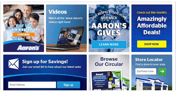
Action-based CTAs on Aarons.com
All in all, language in design is all about saying the right things at the right times. Its effect is subtle, but powerful. As you start to pay attention to these small details, you will notice a change in the way your users interact with your site. With that said, I will go back to Pin…uh I mean “Saving” more inspiration.